


01. Intro
Casa de la Abuela is a tapas bar concept inspired by the warmth and nostalgia of a grandmother’s home — a place filled with memories, stories and authentic hospitality.
Located on the island of Mykonos, the brand aims to create a welcoming space where Mediterranean flavours meet a relaxed and contemporary dining experience.
Medusa Design was commissioned to develop the visual identity of the brand, translating this emotional narrative into a distinctive design system that balances nostalgia with modern hospitality aesthetics.
casa_abuela
casa_abuela_02
casa_abuela_03
02. The Idea
The concept behind the identity revolves around the figure of the grandmother, a symbol of warmth, tradition and generosity.
Rather than referencing Spanish tapas culture directly, the brand embraces a Mediterranean narrative that connects the atmosphere of Mykonos with the familiar feeling of home.
The visual identity therefore becomes a story about hospitality, memory and shared experiences around food.
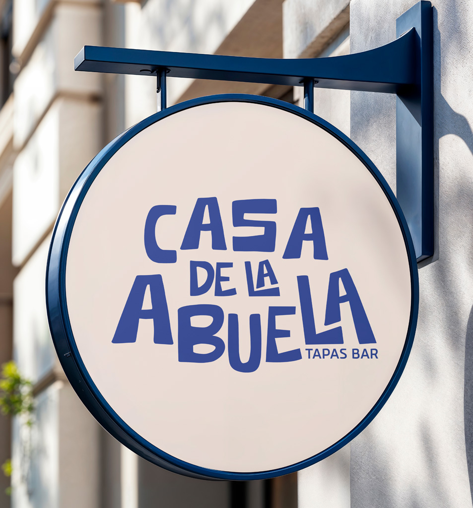
The Logo
The logo of Casa de la Abuela is built around two main elements:
• a playful typographic wordmark
• a character-based symbol representing the grandmother
The custom lettering introduces personality and warmth, while the symbol functions as the visual ambassador of the brand.
The combination of both elements creates a distinctive identity that is memorable, friendly and full of character.
Typography
The custom typography was designed to feel expressive and approachable.
Its slightly irregular shapes give the lettering a handcrafted quality, reinforcing the atmosphere of a welcoming and authentic space.
The hierarchy emphasizes the word “Abuela”, which becomes the emotional center of the brand.
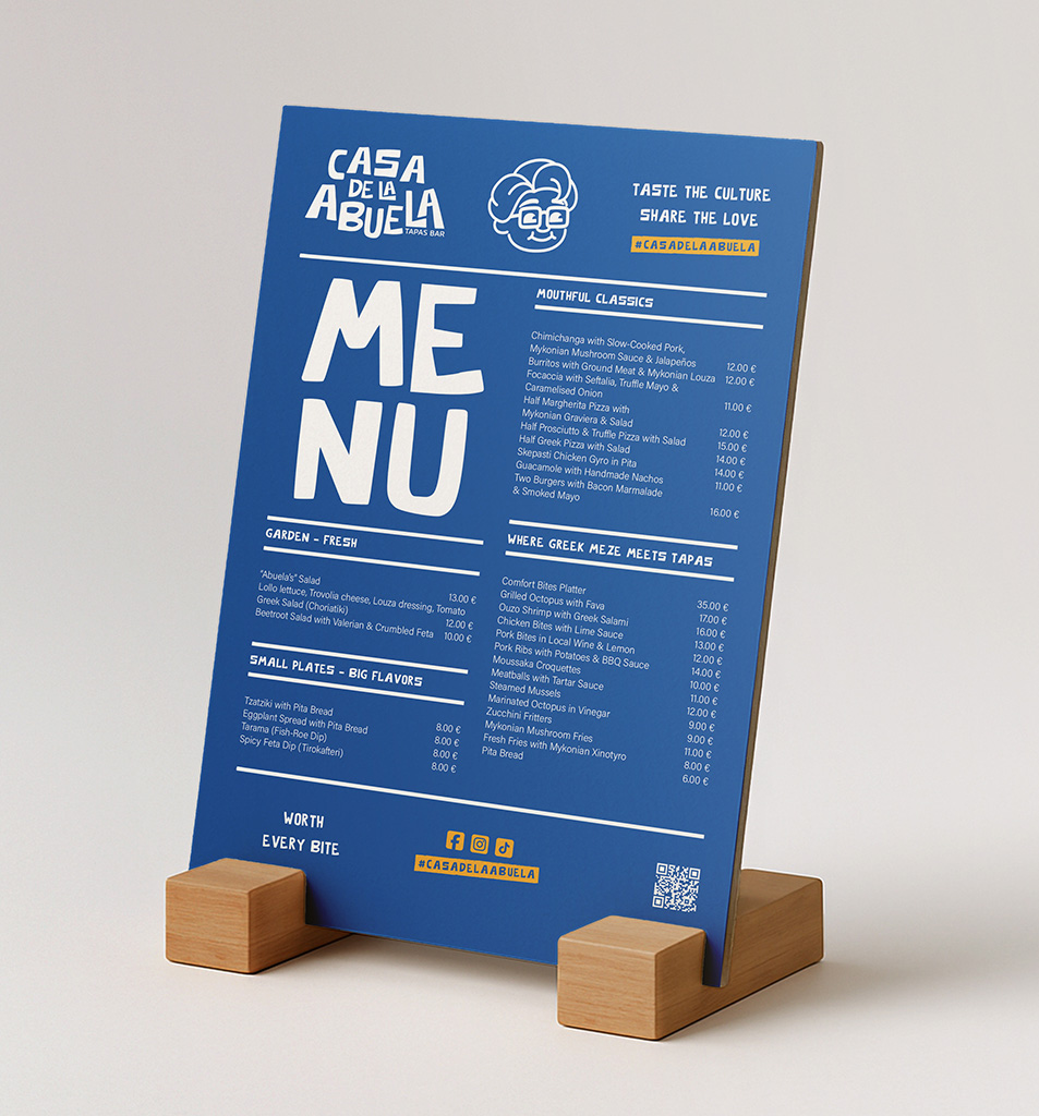
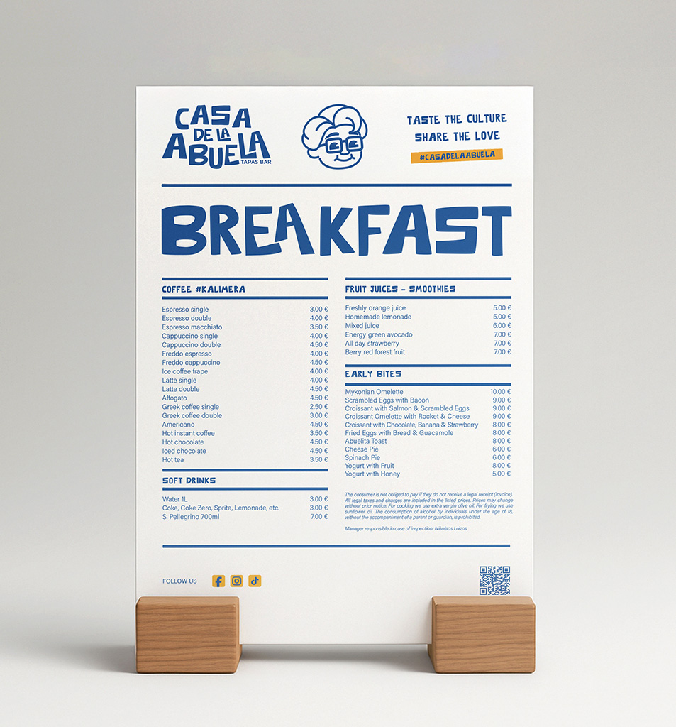
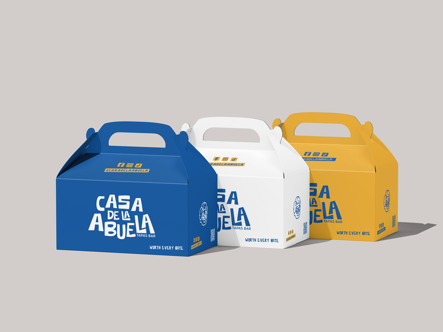
Brand Symbol
The grandmother illustration acts as a brand character.
Its minimal line style keeps the symbol playful, recognizable and versatile across different brand applications.
The icon can function independently from the wordmark in digital environments, packaging or merchandise, strengthening the brand’s visual identity.
Color Palette
The color palette draws inspiration from the Cycladic landscape.
Primary colors include:
• Blue
• White
• Yellow
These colors reference the visual identity of Mykonos while introducing a warm Mediterranean atmosphere.
Brand Applications
The identity was designed to work across multiple touchpoints including:
• signage
• menus
• digital platforms
• social media communication
This flexibility allows the brand to remain visually consistent while adapting to different environments.
casa_abuela_04
03. Outcome
Guide to the Nørebro
The final identity captures the essence of Casa de la Abuela: a place that feels welcoming, nostalgic and full of personality.
By combining storytelling, playful typography and a distinctive brand character, the design establishes a memorable visual identity for the tapas bar.
Have a project? Let's make something great!
Casa de la Abuela
Casa de la Abuela is a new tapas bar set to open in Mykonos, inspired by the warmth and nostalgia of a grandmother’s home — a place filled with stories, memories and authentic hospitality.
-
Date
7 Μαΐου, 2025
-
Skills
Brand Strategy, Brand Identity
-
Client
Casa de la Abuela
Share project